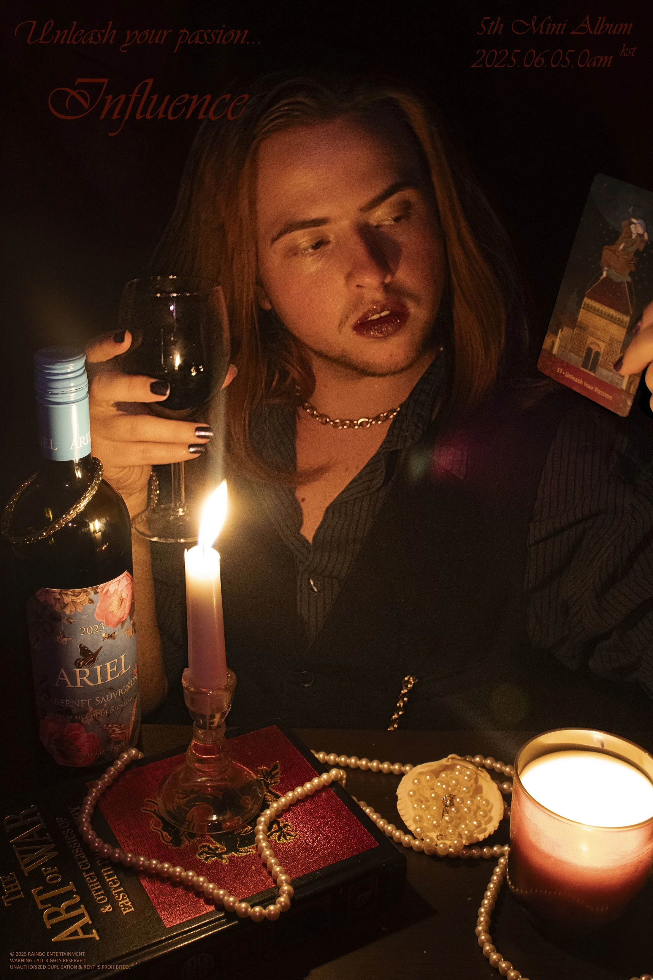
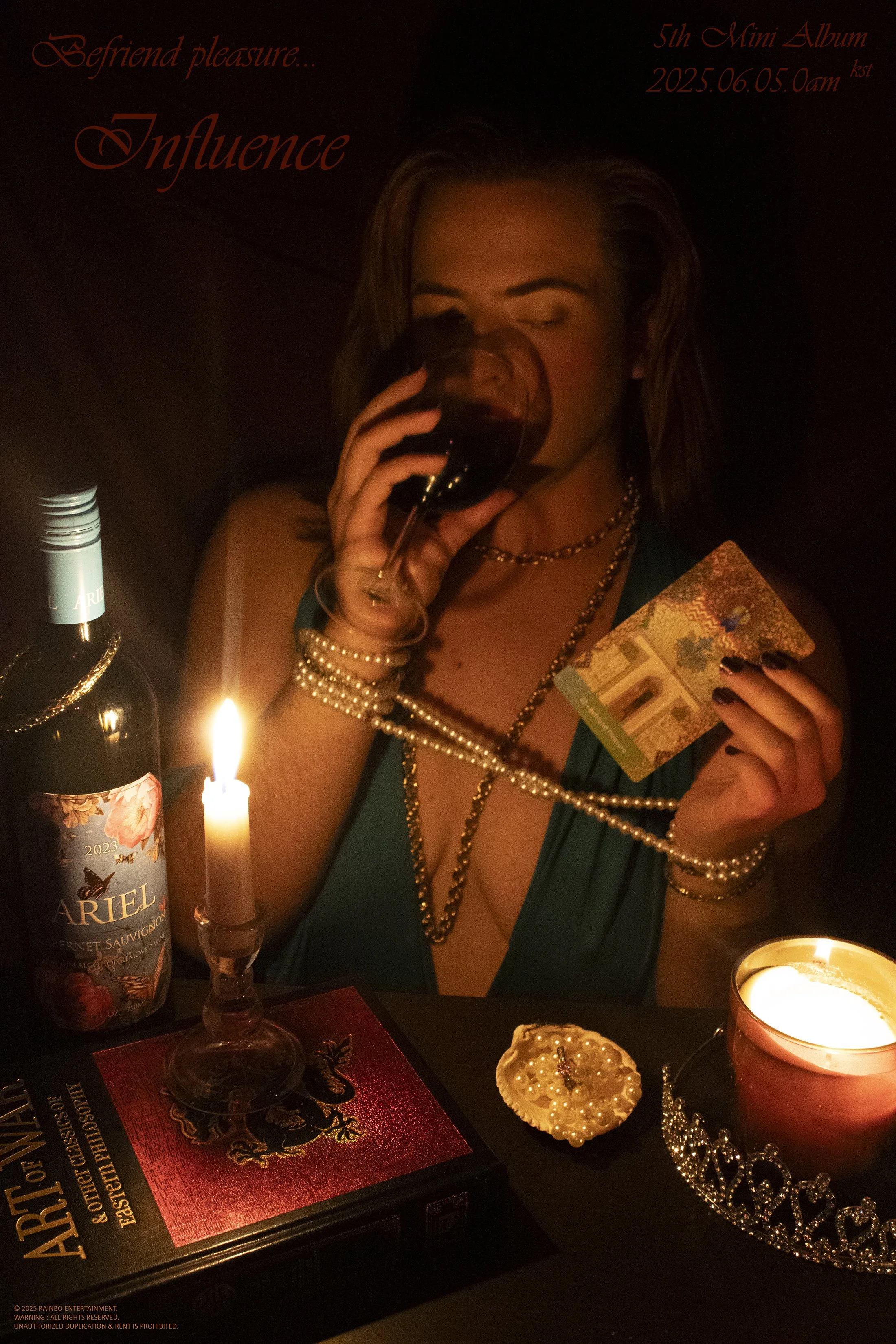
Influence
This series is inspired by the K-Pop industry’s use of teaser images to increase pre-order sales. As they need to sell music without people first being able to listen to it, they must instead sell an idea. The graphic design in both images imitates the format of K-Pop teaser images, with the release date of my imagined album set to Korean Standard Time. The tagline for each piece is the name of the oracle card in that photo.
While I may have been inspired by the K-Pop industry, I chose this aesthetic as my focus because it resonates with an existing side of myself. Everything in the images is things I owned prior to working on this shoot. With this series, I wanted to highlight the gender-accessibility of this aesthetic, portraying myself as both male and female. Only one prop is added between the photos, and the jewelry stays consistent between the two, just styled differently. The names of the oracle cards were specifically chosen for how they interact with societal expectations of sexuality based on gender.